Yonge + St. Clair
August 16, 2016
Intelligent Design
 Somehow in the last 20 years, Yonge + St. Clair became a bit of a desert. It became a shell of its former self. The who’s who didn’t leave, but they stopped playing here. The tower cluster remains, reminding us that Toronto knew that transit-oriented development was well before it became a buzzword – but the energy is gone. It went to Yonge & Bloor and Yonge & Eglinton, as well as to other parts of the city. But Slate Asset Management hopes to change this. Over the last few years they have acquired many of the towers in the area and have already begun to make some much needed investments.
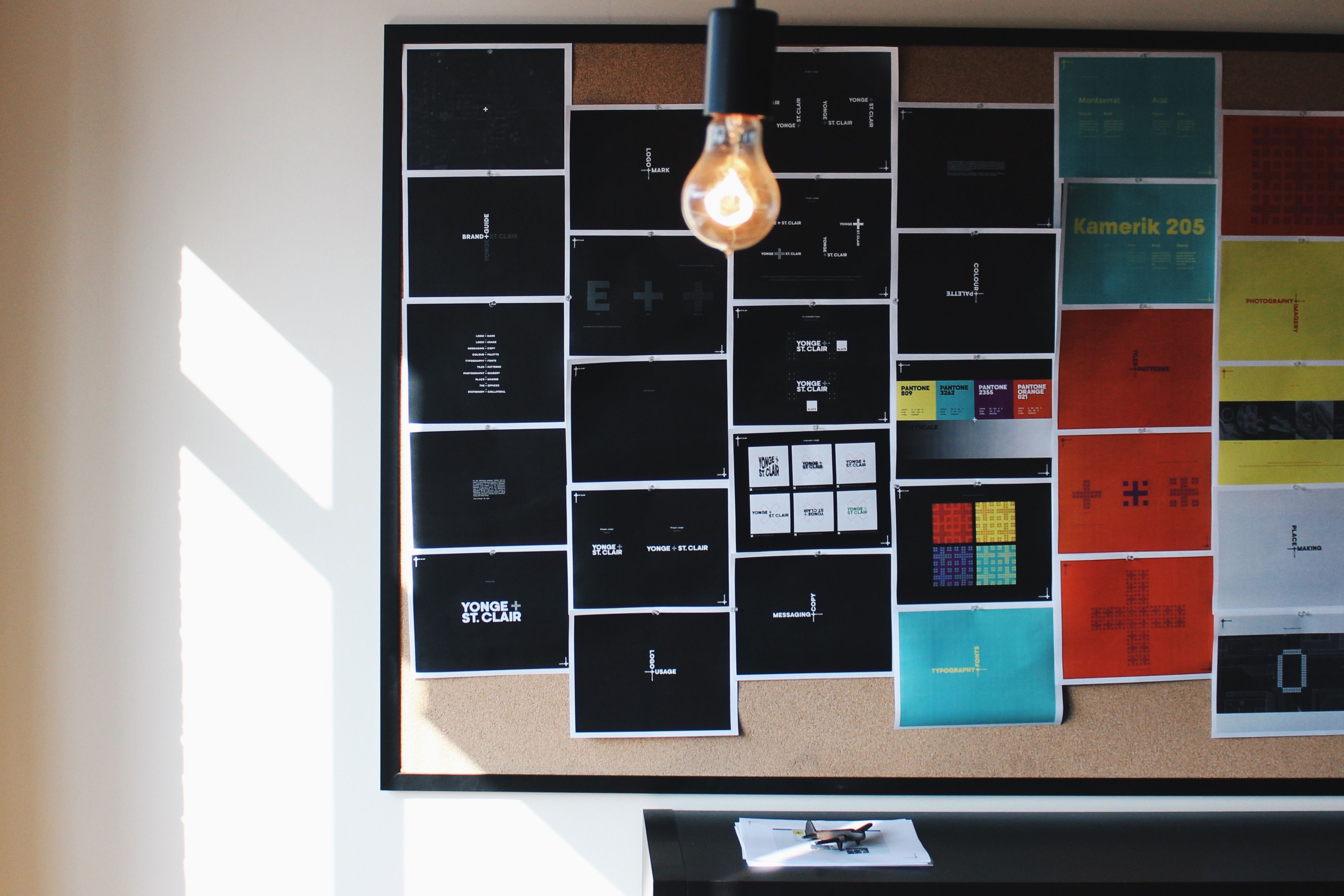
One of those investments is a new brand and identity for the neighbourhood. They hired Toronto’s blackjet Inc. to imagine what this might be and how it could respond to the rich history and character of the neighbourhood.
The Yonge + St. Clair Blog spoke to Art Director Cameron Ward of blackjet about the new look.
Can you tell me a little about where the design came from?
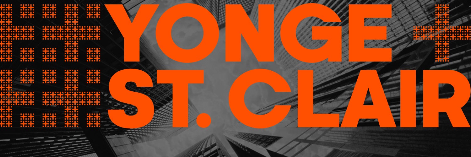
The design came out of a single idea. Yonge and St. Clair is, in the simplest terms, an intersection. It’s where these 2 iconic streets meet. But at the same time, we wanted to embed the eclectic vibe of the area into this simplicity. There’s a lot of character and history in those 4 corners. Our design is a testament to that.
We also wanted to convey confidence. In our minds Yonge and St. Clair – what it was, what it is now, and what it’s becoming – is a confident neighbourhood.
And there’s an architectural relevance too. Our client owns 8 buildings at the intersection so the revitalization will obviously come through in the built form. Gensler [Architecture Firm] and IBI [Group] are already working away. The renderings look great. The designs are really clean and timeless. Like the branding. Hopefully.
It’s very bright.
[Laughing] Yeah they’re actually neon pantones. The colours were chosen to juxtapose the black and white photography we’re using in a few executions. And they definitely pop against the greys of the environment. These aren’t colours that occur often in the city. They’re confident colours.
You mentioned Gensler Architecture Firm. They’re working on the exterior of 1 St. Clair East and the exterior and lobby of 2 St. Clair East. IBI Group has already completed the new lobby of 2 St. Clair West. How do you see the branding living in these spaces?
I actually have a background in architecture so I know how important the details are. These projects are thoroughly designed from top to bottom so we need to be strategic in the way we incorporate the branding. It can’t be something we plaster all over the place, it has to be subtle.
An objective of any branding is to create cohesion. In this case it’s a little difficult because we’re not just looking to make street banners look like transit posters. We’re making sure 8 office towers have some of the same DNA. And we need to maintain the integrity of the architects’ designs. So it’s going to come through in the details. It would be easy to toss big plus signs on the walls and call it a day, but that’s not our approach. And it wouldn’t look very good.
The branding will be present but it won’t be obvious. You might need to keep an eye out for it. We’re still working on some elements. I can’t say much more but it’s going to be really cool.
C’mon.
[Laughing] It’s going to be good. I’ll leave it at that.
Thanks Cam.